2017 Road Teacher, Michele Crawford, knows a lot about color and quilting. A quilt designer since 1989, Michele presented a $5.00 lecture at Road 2016 on The Value of Color which explored the use of color value to enhance quilt design.
[caption id="attachment_4175" align="aligncenter" width="368"]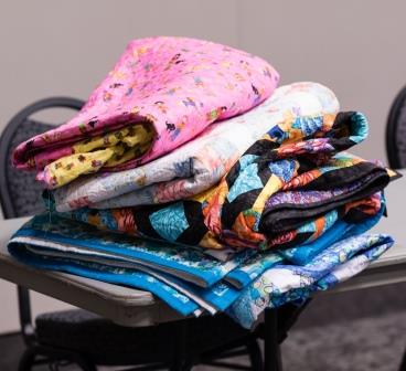 Photo by Brian Roberts Photography[/caption]
Michele began her lecture talking about the psychology of colors which often dictates what a person wears, lives with, and puts in their quilts:
Red: action, confidence
Pink: romance, tranquility
Orange: close relative to red; sets apart from surroundings
Yellow: happiness, optimism
Green: soothes, relaxes
Blue: calm, cool, trustworthy
[caption id="attachment_4177" align="aligncenter" width="336"]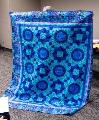 Photo by Brian Roberts Photography[/caption]
Purple: uplifts, spirituality
White: hope, purity
Black: power, authority
Grey: knowledge, wisdom
When creating a quilt, color provides the basic design principles: Movement, Repetition, and Variety. Michele gave some added tips for repetition and variety. She said a Resting Spot should always be included in a quilt including a different color or value or border. She also warned about not having the quilt be too busy. If a quilt is too busy, it’s not pleasant to view because the eye is constantly wandering. And because variety is the spice of life, a zinger color (something not even in the quilt or border) can “make the quilt” sparkle. The color wheel is divided into 3 categories that are considered the pure colors: Primary colors – red, yellow and blue with (*Yellow being the most dominant pure color) Secondary colors – orange, green and violet Tertiary colors – red/orange, red/violet, yellow/green, yellow/orange, blue/green and blue/violet Complimentary Colors appear on opposite sides of a color wheel – red/green for example. Black is the mixture of all the pure colors. White is the absence of color. The true neutrals are the achromatic colors: black and white plus grey. The rule of thumb to remember when working with pure colors is that LIGHT ADVANCES ON DARK and DARK ADVANCES ON LIGHT. [caption id="attachment_4176" align="aligncenter" width="336"]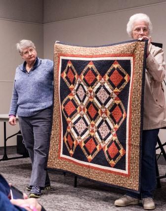 Photo by Brian Roberts Photography[/caption]
Color Value refers to how light or dark a color is. Michele said that understanding this concept is vital in making effective scrap quilts. Quilts will be more interesting not if the colors (or fabrics) do not match, but rather when different colors work together when they are in the same color value.
[caption id="attachment_4173" align="aligncenter" width="336"]
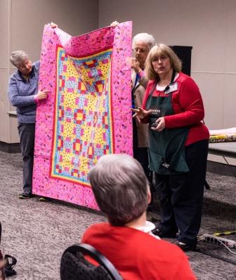 Photo by Brian Roberts Photography[/caption]
Every fabric in a certain color can be divided into three main groups: LIGHT, MEDIUM, and DARK. Within these groups, they can be subdivided again into three separate areas of light, medium and dark (i.e. light-light, medium-light and dark-light).
Light: Fabrics in these colors (white, cream, ecru, etc.) are effective as backgrounds, for contrast and to soften the look of a quilt.
Medium: Fabrics in these colors (medium blue, red, green, etc.) provide a rich look as a blender or contrast between light and dark fabrics.
Dark: Fabrics in these colors (black, navy, forest green, etc.) create a strong bold contrast. These are the colors that are going to pull together all the rest of the colors or “pop” in a quilt and are good for borders.
[caption id="attachment_4174" align="aligncenter" width="364"]
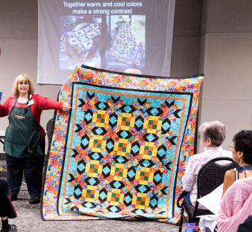 Photo by Brian Roberts Photography[/caption]
When deciding on the colors for a quilt, Michele recommended starting with the block design first and pull the colors to the outside of the quilt. Whatever colors are used in the center of a quilt should be the border fabric/color.
To learn more about Michele and her quilt designing, please visit her website.]]>
Tags: Color Wheel, Flower Box Quilts, Michele Crawford, Quilt Color, Quilt Design


